
SAMSUNG: SOCCER EXPERIENCE: “JOIN THE GAME” APP
Creating a Soccer World Cup Application for the Brazillian team´s sponsor

Company: samsung electronics
Date: September 2013/ May 2014
Design Team Size: 2
My Role(s): UX Management, Strategic Direction, Requirements Definition, Wireframing, Style Guide Creation, Visual Design
As Manager of the UX Team in contents and services – Brazil at Samsung, I was charged to oversee the development of an application for the Soccer World Cup. The project involved the Brazil Contents & Services and R&D teams, the Latin America Media Solutions Center, as well as the Brazil Marketing and New Business development teams.
process chart

Kicking Off
To kick off the project and generate ideas, a group of 6 soccer fans was interviewed in a semi-structured way about what their expectations would be of a great soccer application, what was their common usage and habits towards existing applications and other information sources, such as websites, magazines, and TV shows.
Benchmarks & Requirements Definition
We reviewed some of the most common apps and websites used by the fans, as well as some new entrants in the field, to compare the results with the ones from the user´s interviews. The insights from these interviews gave us the idea to organize the experience of the application into three different phases or “moments”: the pre-game, the in-game and the post-game moments. By mapping the user needs in each of these different phases, a technical requirements document was written that contained 52 items to thoroughly describe the application´s behaviors.
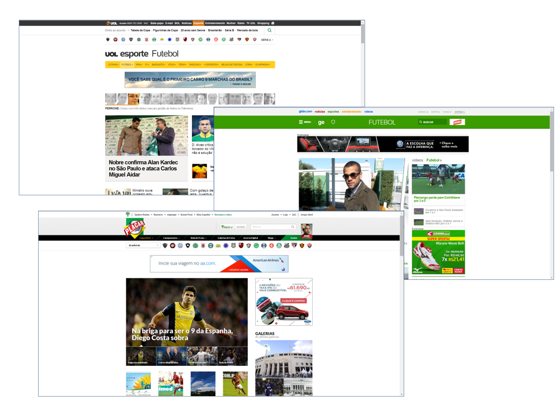
Some of the Brazilian soccer websites which were benchmarked
Information Architecture
The features were solidified and an information architecture flow was designed. At this point, a huge challenge was defining how to distribute the information in order to create the least amount of hierarchical sub-levels. Another challenge was how to properly adapt and display the correct information for each of the user moments, in a way that would not make the user feel lost within the application.
We decided to focus mostly on three major branches of information: games, tournament and teams. Each of these branches would show adaptive information depending on the user moment. For instance, if a user goes to the game section in pre-game phase, he or she may see a information about the history of the match in the competition, as well as the ability to send reminders to friends and pick a winner for the game. In the in-game phase, users can see a play-by-play description and see real-time statistics of the game, watch videos of the best plays and chat with other users. In the post-game phase, the screen displays all the consolidated information.

Final Information Architecture of the Application
Wireframes
Due to the developer being based in another city, we had to provide very detailed deliverables in order to ensure that the application would work exactly as planned. A 60 page wireframe document was created and then reviewed thoroughly. At this point, the back-end of the application was already being developed simultaneously, so some of the feedback from the server team and the development team were incorporated.
We also had meeting with the UX and dev teams for the TV and the browser applications, in order to make sure to incorporate any idea that would improve the experience.
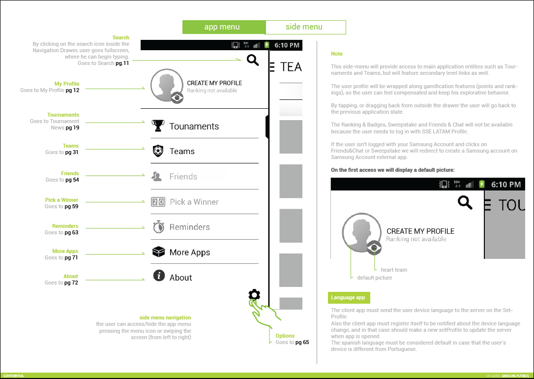

Sample page of wireframes document
Style Guide
Along with the main mobile application, both a browser and a TV-based complementary apps were to be designed. Since these apps were created by external agencies, we decided to create a style guide to drive the visual style for the developers.
The style guide along with the wireframes allowed our partners to make informed decisions without having to constantly consult the team responsible for the mobile app. Weekly meetings were held with the other teams in order to keep track of the progress and ensure consistency across platforms.

Sample Pages from the style guide
Visual Design
The Visual Design was based on the insights provided by the soccer fans during the interviews phase.
The main concept was to have a dark, serious feel to the application, with a blurred image of a football field on the background providing contrast and depth to the white text and information presented up front. Highlight colors are green (once again alluding to the soccer field colors) and light blue, toprovide a nice legibility when overlaid by white text or graphic elements.


Sample screens with approved visuals for the application